What I am going to do first!
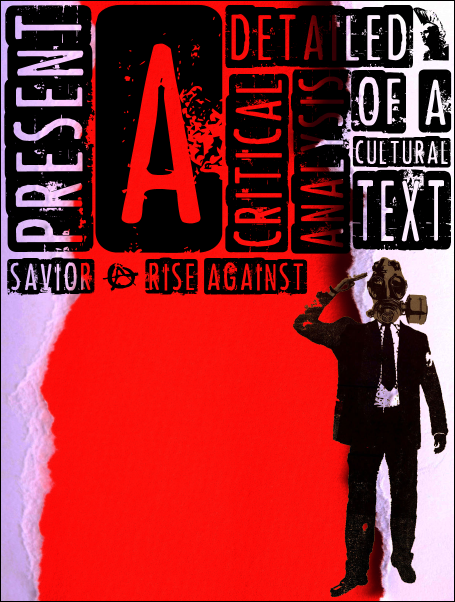
I need to design a poster which is in clear correlation with the 'TEXT" of my chosen area of research. The 'Savoir' music video by Rise Against.
I do not plan to go all out in this aspect of design and simply hope for the best, but I plan to use influential aspects from other designs to help give me some unique ideas as to how I could go about making it a well as what feature I could include to make the design of my poster more appealing.
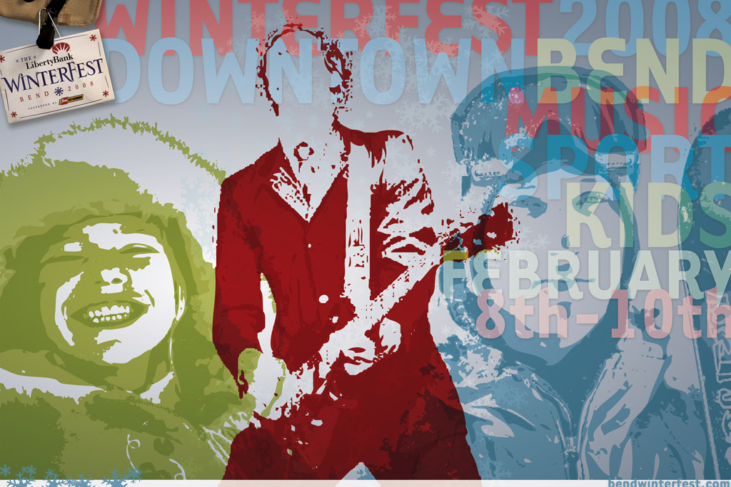
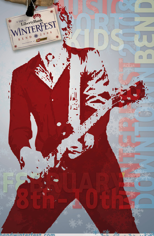
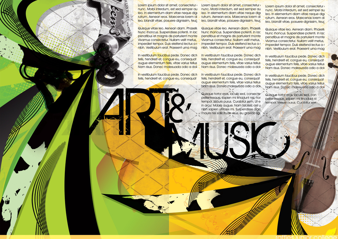
Here are some cracking examples of Music Poster Designs:
I do not plan to go all out in this aspect of design and simply hope for the best, but I plan to use influential aspects from other designs to help give me some unique ideas as to how I could go about making it a well as what feature I could include to make the design of my poster more appealing.
Here are some cracking examples of Music Poster Designs:
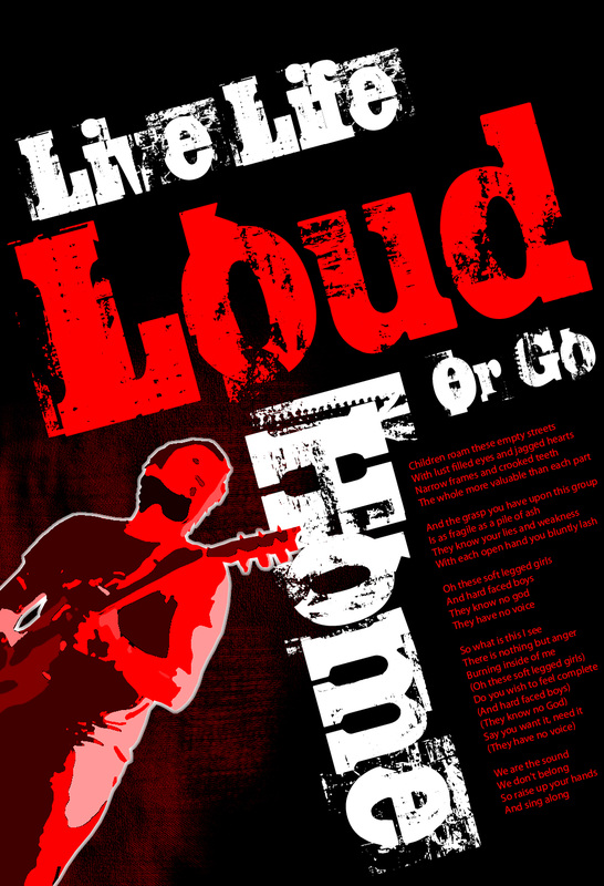
Brilliant example of what the poster needs to be like!
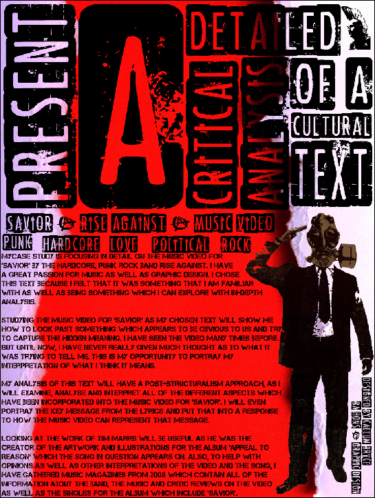
Plenty of text, but not going over the limit that is required. Very visual but subtle at the same time due to its limited colour palette. Images / Illustrations are included to help portray the idea behind the poster design. The Title. Bold and Presentable, as well as legible and not eccentric on the choice of typeface. This poster design contains everything that I need to include in my poster design. To help make sure that I keep to this, I'll need to make a list of what is needed as well as making a checklist.
What needs to Be included?
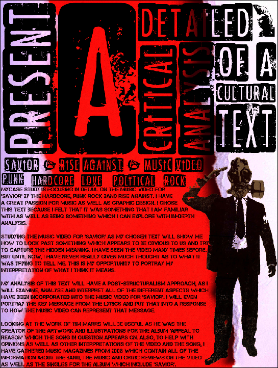
The Poster will be a presentation of my preliminary work of my essay.
The poster itself needs to include:
The poster itself needs to include:
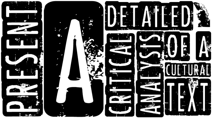
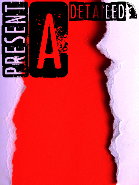
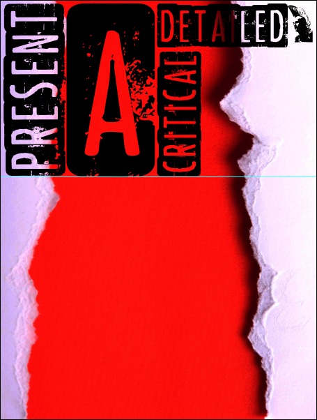
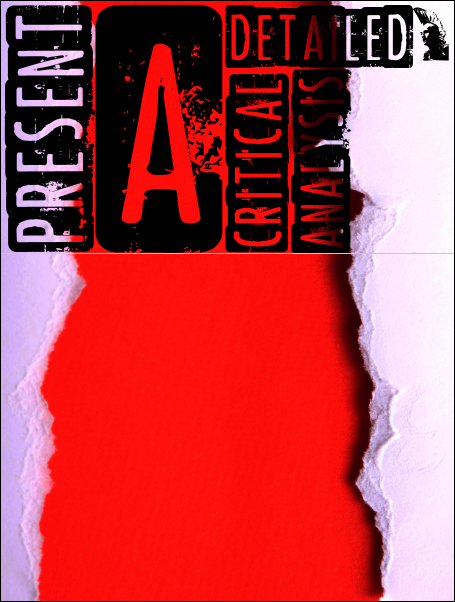
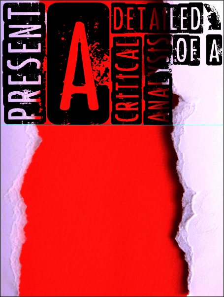
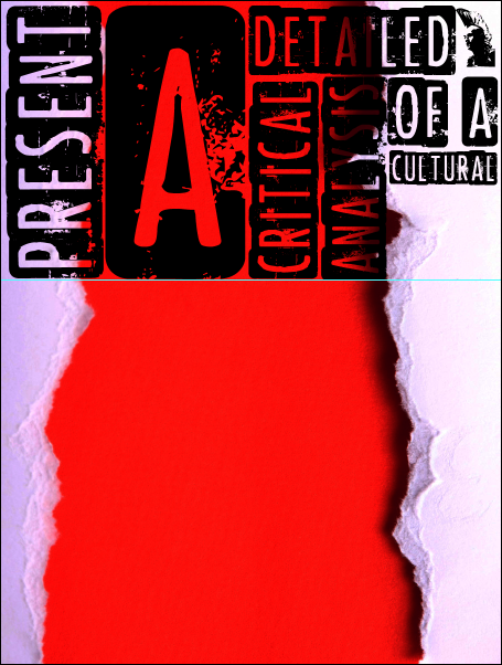
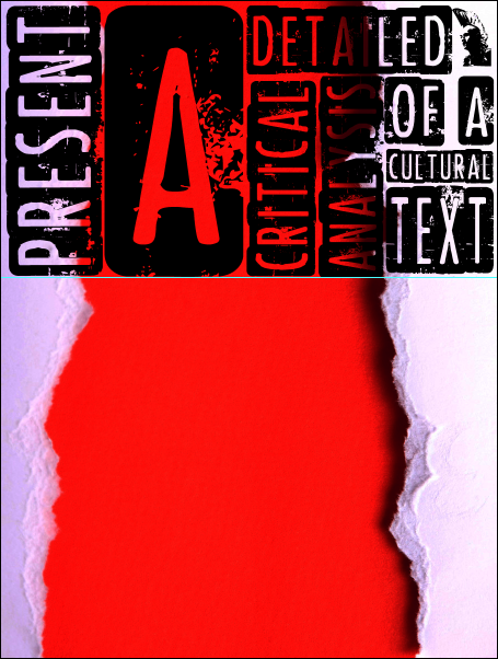
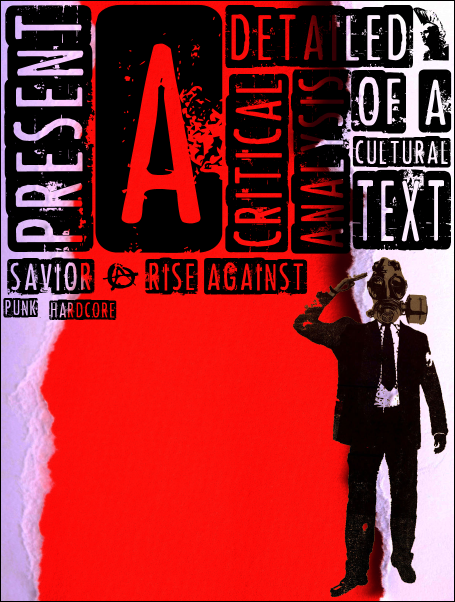
- The Title Question - "Present A Detailed, Critical Analysis Of A Cultural Text"
- My Case Study.
- A brief account of your choice.
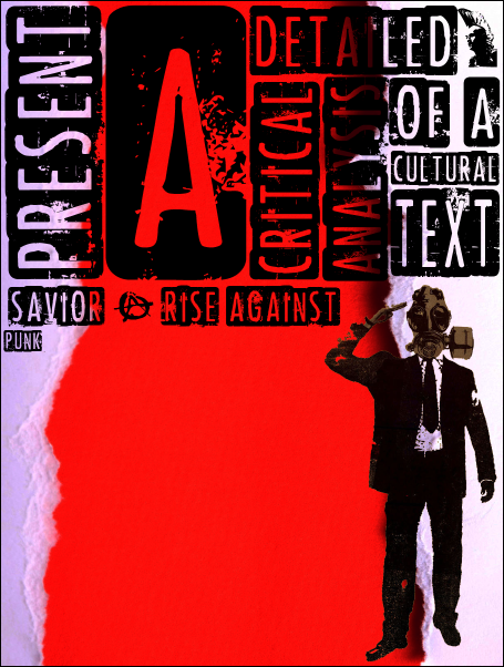
- An Illustration(s). Keywords (4-6) These keywords best describe my research area.
- Details of the critical approach that I will be employing during my analysis: Maxist Ideas, Poststructuralist Ones, Feminist Ones, Etc.
Poster Format
- The Poster needs to be created in A4 Format. NO BIGGER & NO SMALLER.
- The Layout and Design should clearly reflect the content.
- The Poster needs to be Legible. (Be Able To Read Clearly)
- No less than 250 words and No more than 500 words are to be included in the design.
- Images for the Poster should be fit for purpose. Show appropriate levels of detail.
Checklist for the creating process of the poster
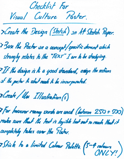
Here is my check-list which I am going to follow to the letter to create my first design concept for my Visual Culture Poster.
If I follow each of these points of my check-list in order to create my first concept for the poster, I am confident that my final piece will look just the way I want it to as well as being a design that I feel comfortable with and one that others will feel comfortable with as well.
However, I know that this checklist will be very valuable to the creating process of the poster, but, I know that along the way I am going to discover new, interesting and unique things which are going to serve the poster design well. The leads me to believe that the checklist will need to be updated as well.
Following my imagination in the planning and the designs of the poster will help in more ways than one. In the end, if I play my cards right, the poster will become a very successful piece.
Basic design starting point
I have started coming up with different concepts of poster designs as to which I can create my final piece.
Here is what I have come up with for the design:
Here is what I have come up with for the design:
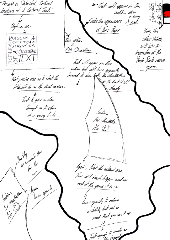
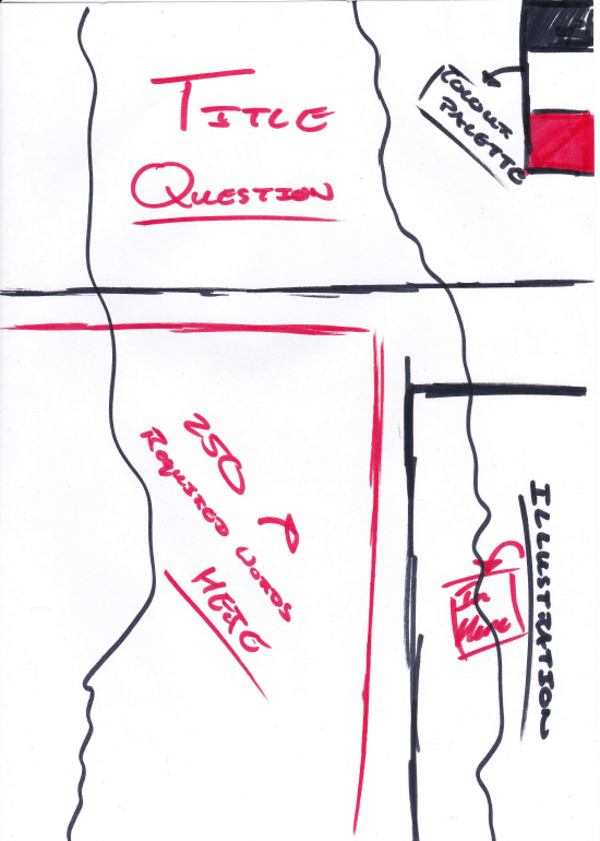
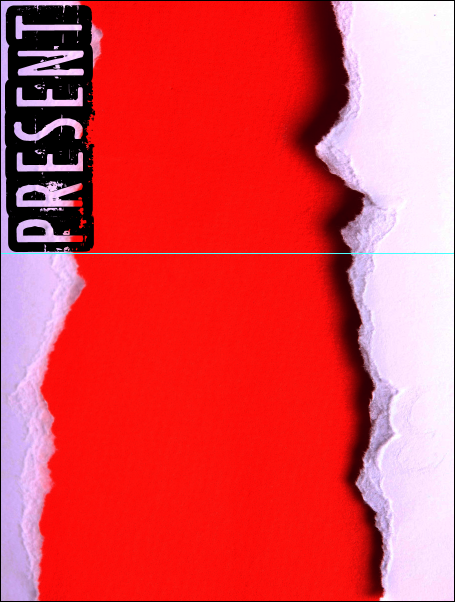
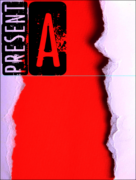
The poster design
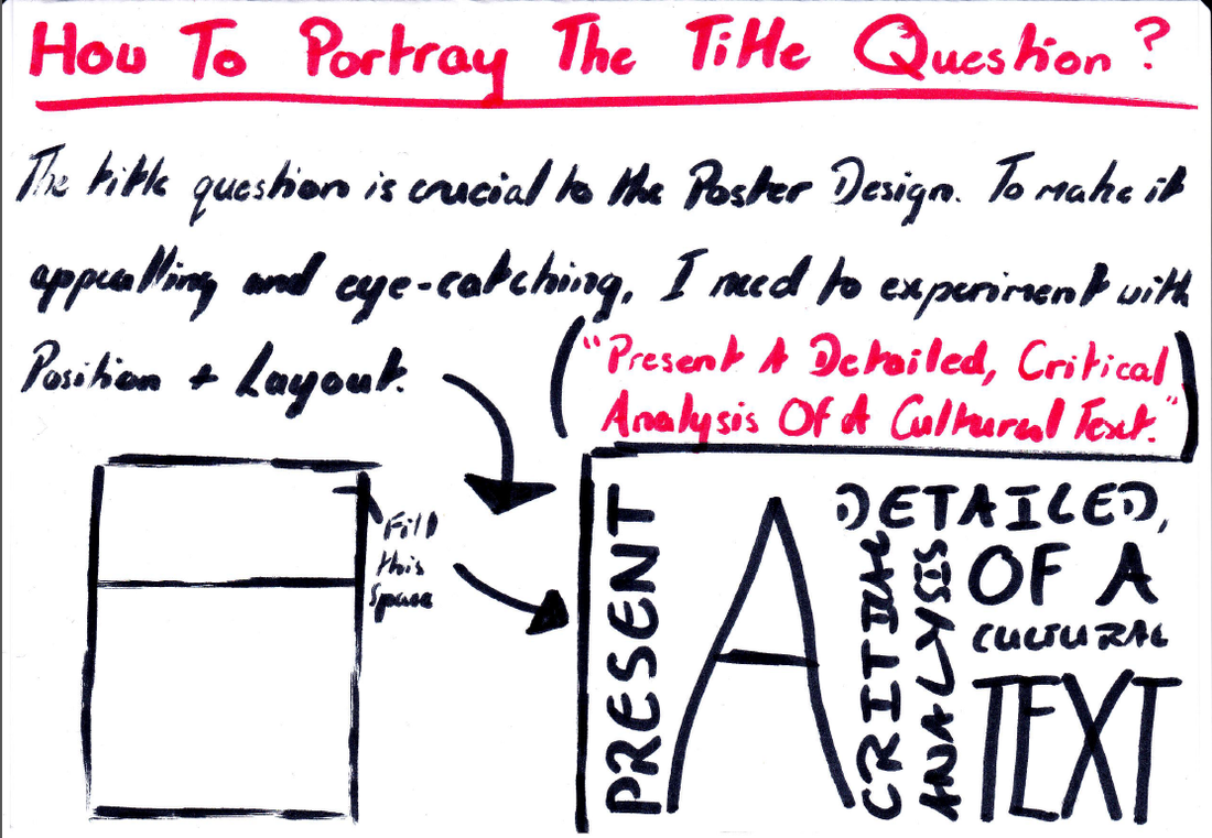
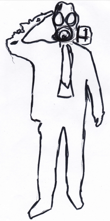
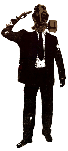
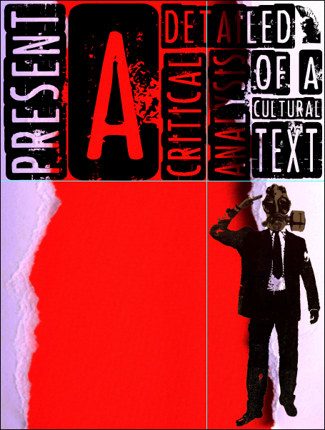
I wanted to create the design of the poster completely by hand and then scan it into the computer so that I could edit it if needed in certain areas. I was also able to make the title question to a successful standard as well as creating it with a typeface which fully represents the theme of the "Text" which I am studying. I was also able to create it in the exact same layout which I had planned. Another aspect which the poster needs to include is an illustration. I thought that I might draw something which represents a theme of survival. What I needed to do was to create the illustration and having it link to the meaning of the song itself.


Meaning of the Song "Savior" by Rise Against
This song is about love, but not in the way that you may think. When looking at Rise Against's other songs, all of them follow the same trend; rarely using "I" or "Me", and almost always using "We" or "Us". This band is very politically based, and exist almost only to relay a message.
In Savior, although words like "I" are used, they are placed and said in a way that makes it more of a group of people. This song suggests being about the government in many places.
"That's when she said I don't hate you boy
I just want to save you while there's still something left to save"
Perhaps the government is in a poor state, but instead of revolting, repairing.
The whole first stanza of the song:
"It kills me not to know this, but I've all but just forgotten
What the color of her eyes were, and her scars or how she got them
As the telling signs of age rain down, a single tear is dropping
Through the valleys of an aging face, that this world has forgotten
There is no reconciliation that will put me in my place
And there is no time like the present, to drink these draining seconds
But seldom do these words ring true, when I'm constantly failing you
Like walls that we just can't break through, until we disappear"
This can not only show the change of the government, mainly in ideals, but how society is turning inward further and further, avoiding international issues.
The illustration and How could it represent the lyrics
As you have seen, I have created an illustration which I intend to use for the final poster design. However, although I like the concept, the way it is visually at the moment, to me, is not enough to help make this piece a professional standard of work. I needed to edit it. I took it to Photoshop and had some fun with a few of the filters and effects. I wanted to stick to my colour palette of black, red and white, and so I simply used black and grey for the colour tones. I was able to fix some of the rough areas and smooth them out a bit. Using the blending option, I was able to subtract very minor sections of the image, which to me afterward, looked like a graffiti stencil piece. From what I've gathered, from the lyrics of the song, I have been able to accurately depict the song through this illustration.
Design process + Layout


My Visual Culture Poster