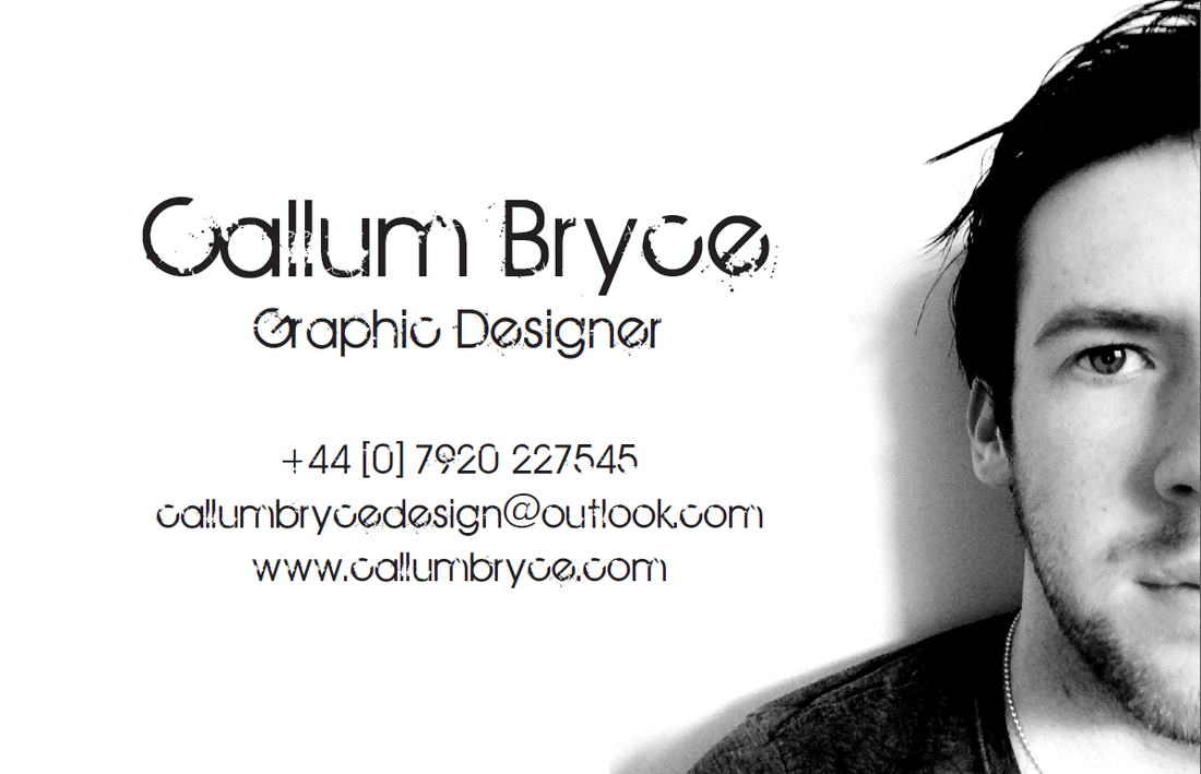
Business card (FRONT)
My first design for the front of my business card was far too basic and incredibly pointless. For some reason, I still to this day have no idea why, me playing live with my band on stage popped into my head. I started thinking about the fact that we are a signed band but not the type of band that uses a light show at our gigs. We put as much energy and effort into our shows to get the audience to know who we are. That's what I wanted my business card to show. No fancy effects, no pointless attempts, I chose a really good image of myself and only used that and some unique yet simple type to portray my skills and to show people as well as future clients who I really am and what I can do.
Business Card (BACK)
I waned the back of my business card to show my logo but in a more up to date fashion if you will. I went into illustrator and fooled around with many different techniques as to how I could go about creating my double X.
I came to the final decision purely out of luck. I used the line tool and manipulated the effects to give an appearance of a paint wipe.
Also, instead of the colour palette being really bright, I decided to change the colour theme and have it work for the whole business card. Black and White seemed to prove the most effective.